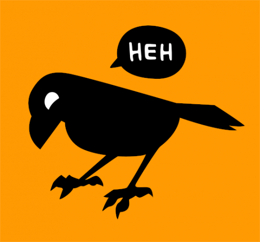
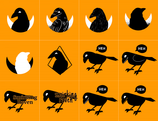
Hey, I’ve been thinking my logo needed a cleaner look, so here it is in all its magnificent forms and colors.
I went for simplicity and choose a nice calligraphic typo for the name.
Here are some sketches and research until I found something I liked.


